
Brief
Sony Playstation is releasing their new console. This brings an end to the 7 year lifespan of the current model, the Playstation 4. In those years, PS4 brought us many amazing games, polished the online experience, but like all things, was not without its flaws. One of those flaws was the user interface. Unlike the simplistic UIs from its predecessors, the PS4's UI is cluttered and convoluted. In this quick design, we will polish up the overall experience while focusing on the menu.
Listening to the feedback
Goals
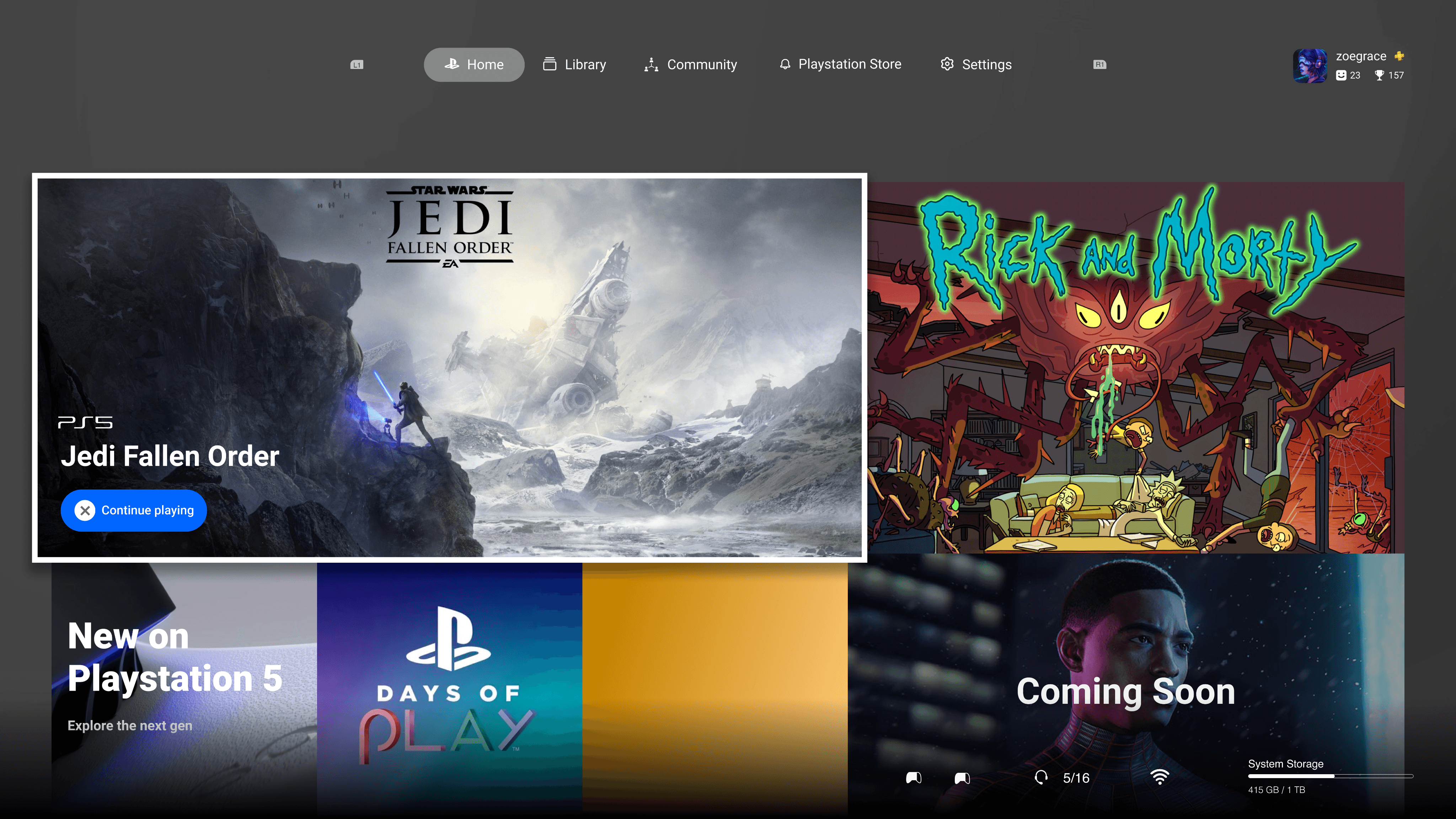
Build a single menu that players can use to reach any desired feature or setting. This can help mitigate players feeling lost or confused while navigating through the user interface.
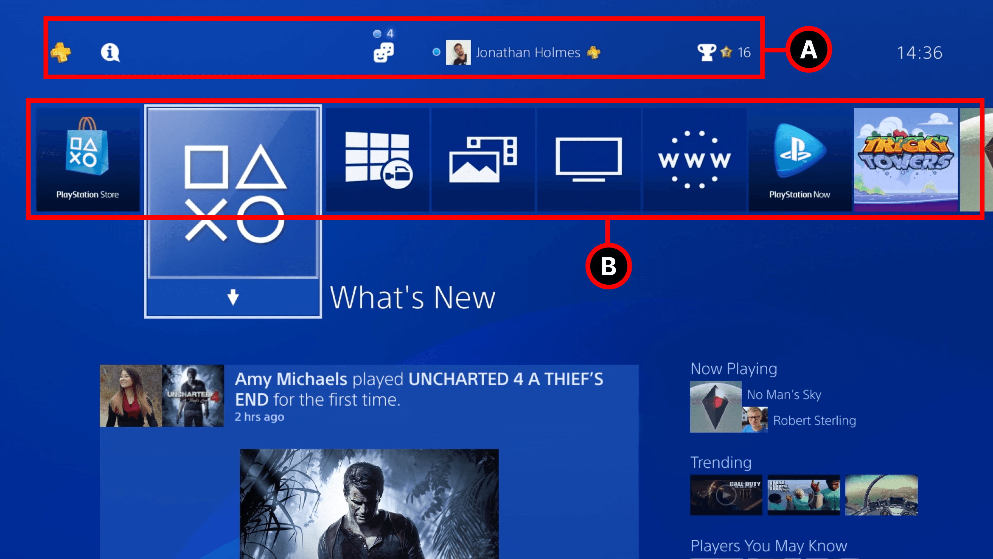
Provide useful information at a glance to reduce the amount of additional screens a player must enter
Design a user interface that allows players to quickly continue where they left off and feel in control at all times
The new and improved
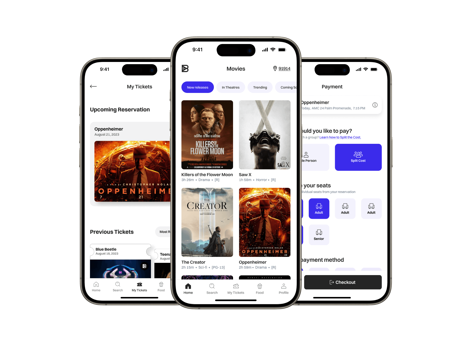
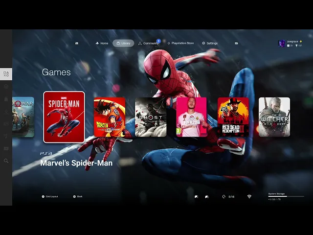
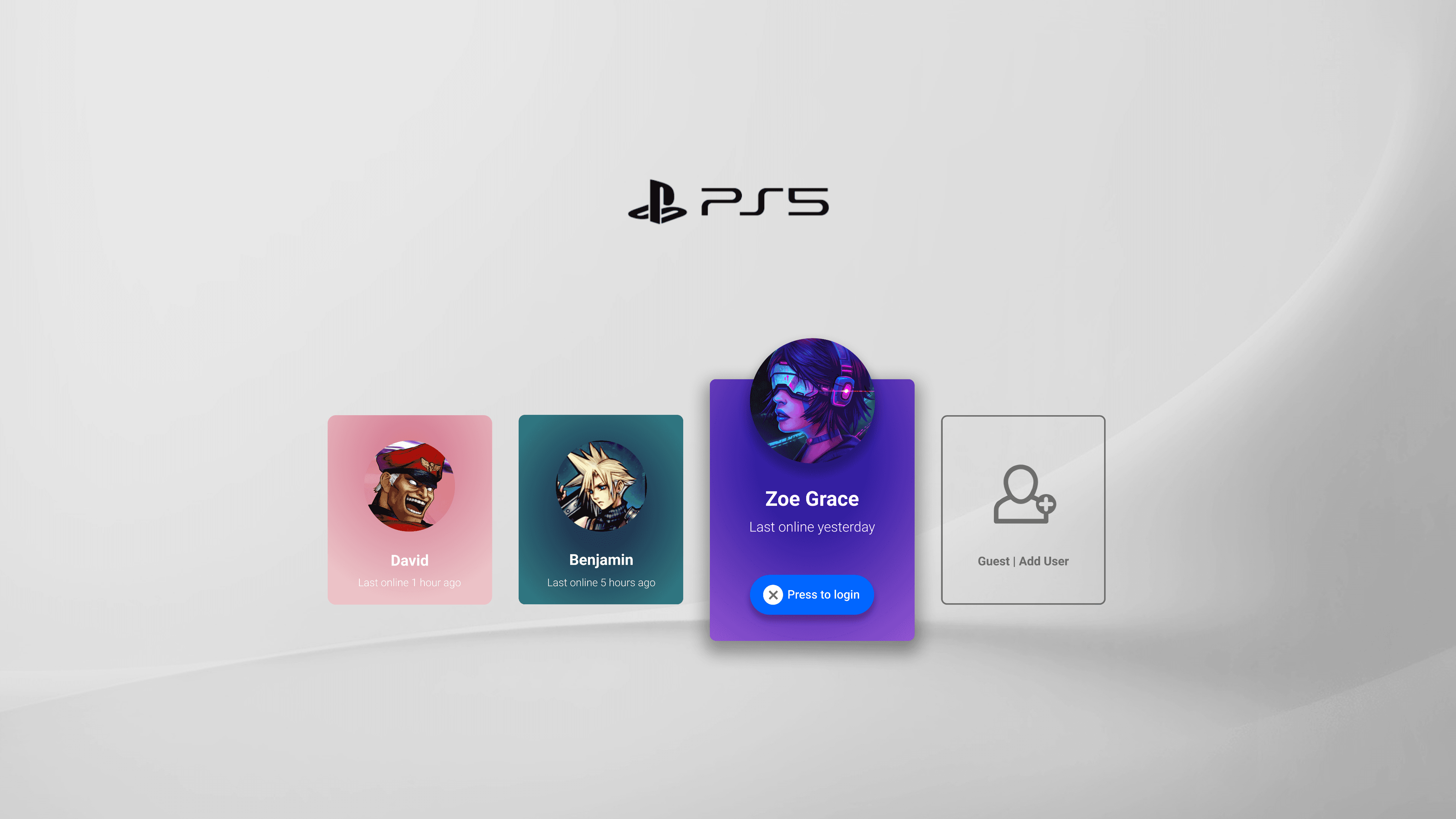
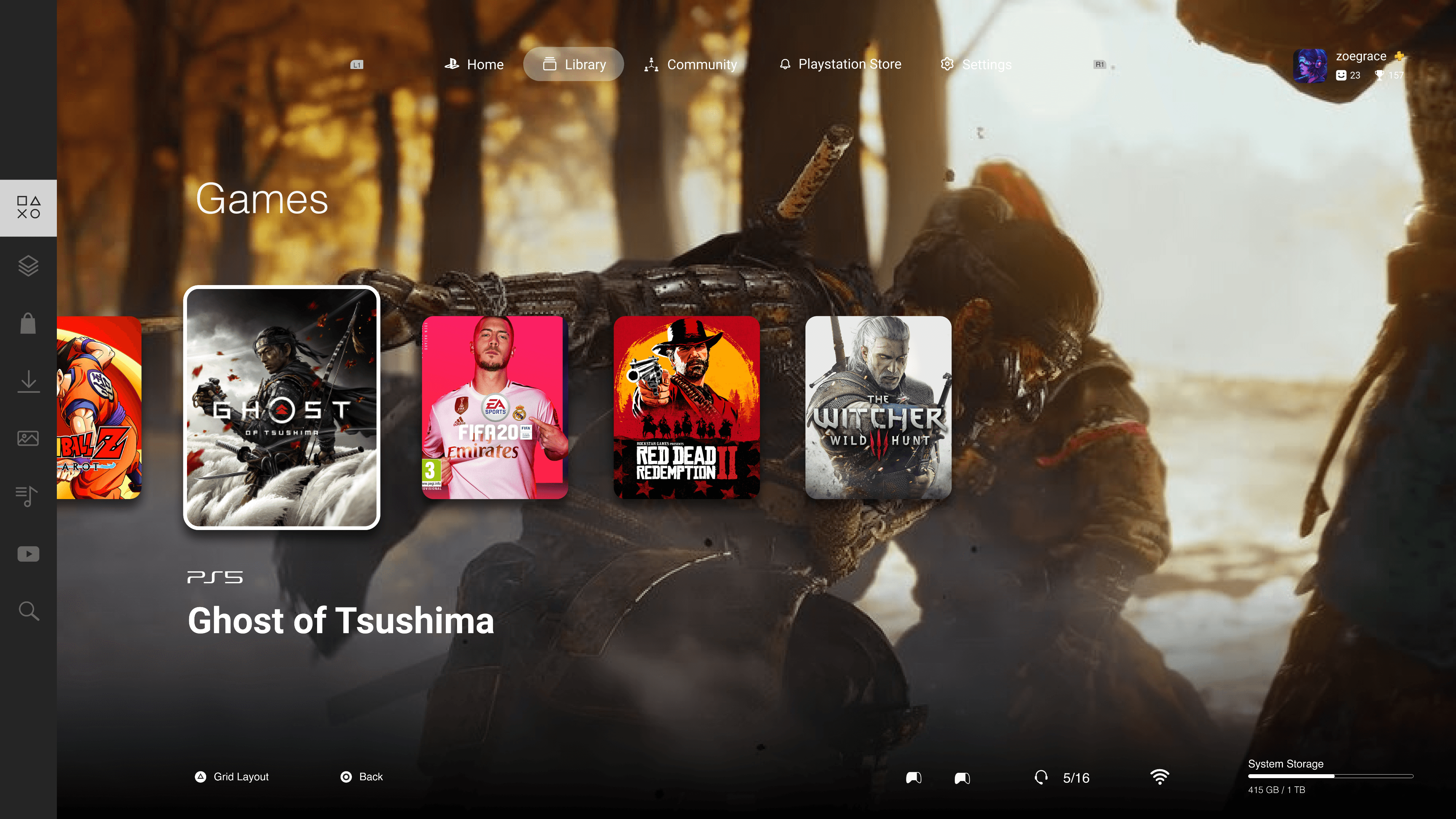
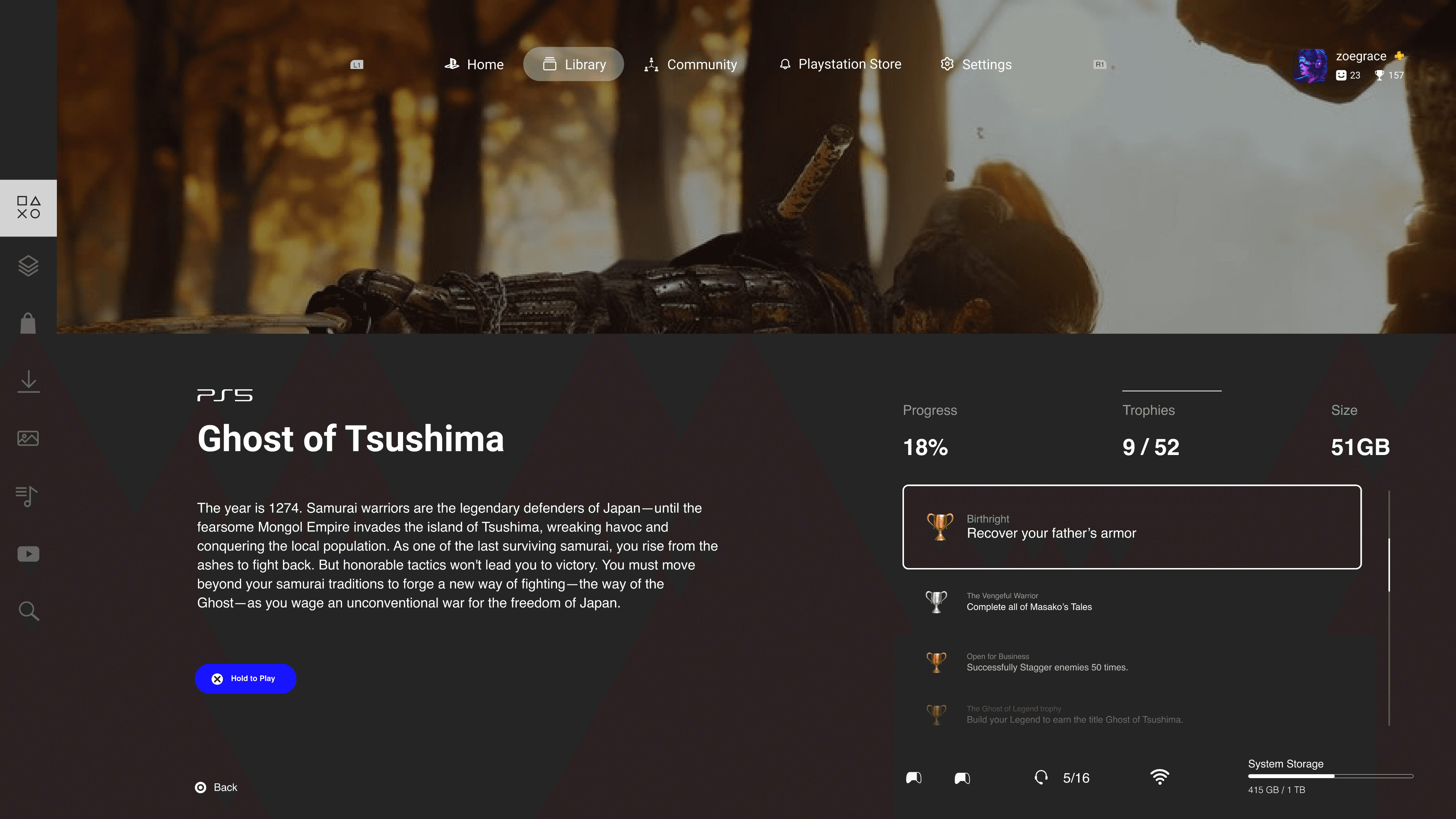
With changes made to the main menu, the rest of the UI needed to match visually. I took up the challenge to redesign the rest of the menu so that players can have a cohesive experience. Below is a prototype that captures a player logging into their profile and up till the start of a game.
Taking a closer look

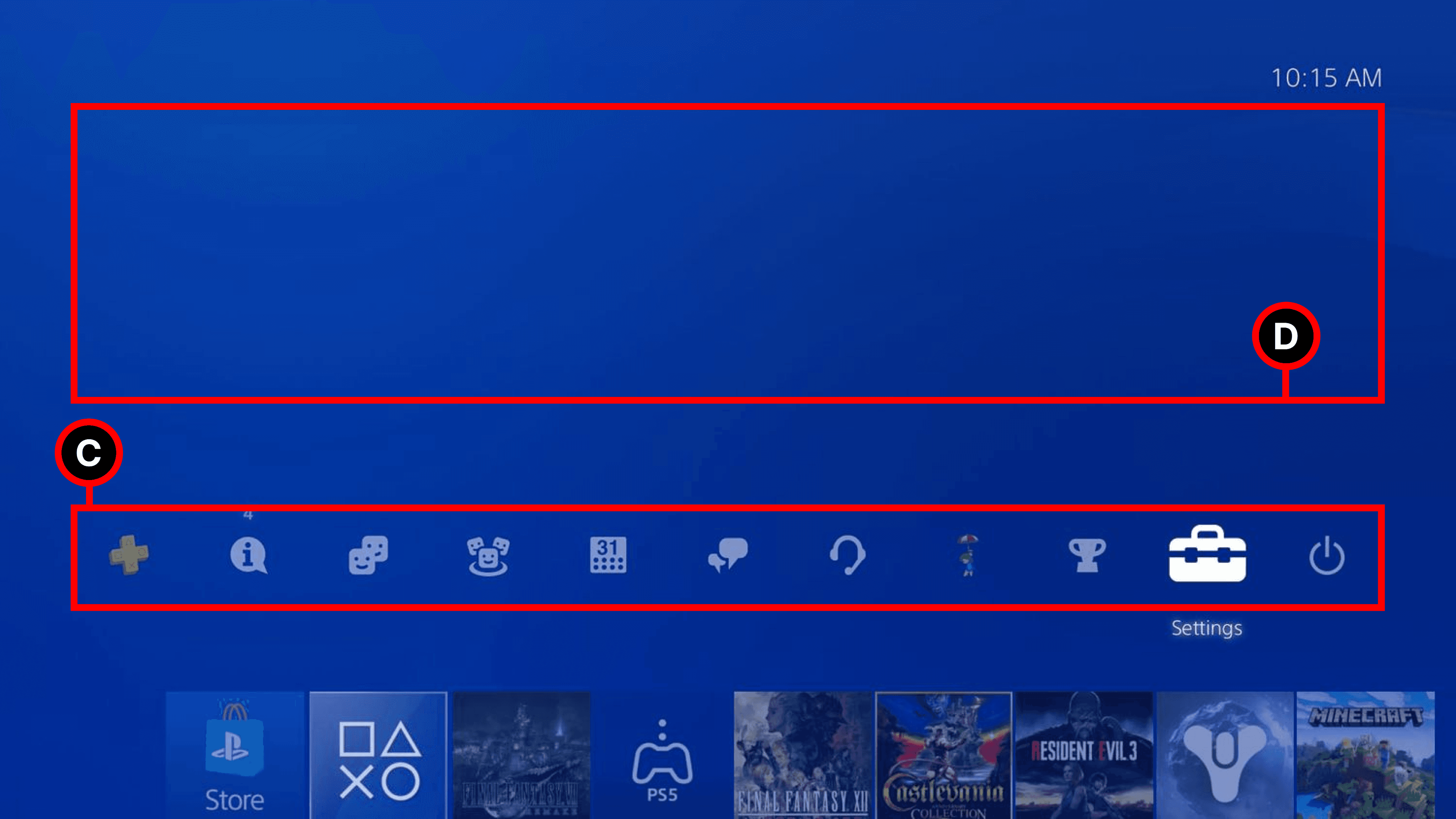
C
Use of Space
+
Relevant content is displayed based on current navigation menu option
+
Unlike with the previoius menu's functionality, this space is used as the main area to display information, results and other details.
+
Large space allows for elements to breathe or for more information to be displayed based on needs
Conclusion
Finally, no more double menus, or hidden libraries. This new design tackles all those things and more. The new UI focuses on putting the player first. Now, the joy and beauty a player experiences is not just from the visuals, but rather its ease of use. As players, we hope the upcoming Playstation 5 interface enhances the gaming experience, and does not once again become an obstacle.