


Intro
The whos and whats
Team
Elie Puffelis
My Roles
UI Design, UX Research, Prototyping, Logo Design
Tools
Figma, Photoshop, Illustrator, Miro
Duration
8 Weeks
TL;DR
The whole case study in a nutshell
This project was inspired by a real world personal experience, where I and a group of friends wanted to plan a day to watch a movie together. However, in the instance where one person couldn't buy everyone's tickets, we found it a bit tedious having the whole group take time out of their schedule, coordinate the movie details, and buy their ticket in time. This had me wondering, surely we are not the only ones with this sentiment.
So
what
did
I
do?
I
began
with
a
questionnaire.
From
the
participant's
answers,
I
recognized
similar
behavioral
patterns
and
pain
points.
I
learned
that
they
like
to
go
to
the
movie
theatre
with
their
friends
and
family
in
their
free
time.
However,
most
of
the
time
the
responsibility
to
organize
a
movie
day
falls
on
them.
Due
to
the
little
free
time
they
have,
they
need
a
quick
and
easy
way
to
plan,
reserve
and
purchase
movie
tickets
for
their
group.
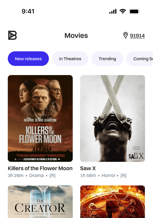
Now that I understood the problem users were facing, I wanted to find out why the current available movie apps did not address this pain point. I chose to do a competitive analysis and used those findings to sketch up some potential solutions. As a result, I introduced a new feature called Split Cost that specifically addressed the reservation hassle for a group of people. Additionally, I sought to improve already existing features to streamline the overall purchasing process. I began to sketch out these ideas. Then those sketches turned into wireframes, and those wireframes lead to a MIFI prototype which I used for a usability test. Finally, after a couple iterations, I developed a HIFI prototype based on feedback from the usability test and successful KPI metrics.
Questionnaire
The best way to find something out is....to simply ask
I wanted to get a better understanding of what the current experience was for purchasing movie tickets. By simply asking, I could find out what the user base liked, disliked and wished would improve when buying tickets
EMPATHY MAP
Getting to know the ins and outs
After the questionnaire, I grouped the responses into four behavioral categories. From this I was able to observe not only what the users have to say about their current movie going experience, but what they feel, do, and even their thoughts of what their movie experience should be like. As a result, my understanding of the user base went pass a surface level.


USER GROUPS
Same thoughts, different people
After carefully analyzing the four groups, I recognized a pattern of reoccuring frustrations and sentiments users shared. From here, I synthesized conclusions for each pattern. These four conclusions became the building blocks of what I wanted to solve.
Pattern
Online tickets help avoid lines
Buying tickets online mitigates "sold out" surprises when buying tickets at the booth
Conclusion
Busy bees may work in lines, but busy people don’t have time for them......ever
Pattern
Seat visualization and digital ticket stubs are current features found in movie ticket apps that users expect to see
Conclusion
Do not tamper with the widely accepted features users love to use.
Pattern
Incorrect seat information, or timing out during checkout frustrates users, leading them to buy tickets at the booth instead
Conclusion
Online obstacles can lead users to go back to doing things the old way, and not for the better
Pattern
Movie night with a group of friends is always fun, but if only the process of making it happen was just as easy as showing up
Conclusion
Users want the process of reserving movie tickets for their group to be less of a hassle
PROBLEM STATEMENT
The Challenge
Most people have jam packed schedules, and they try their best to maintain a good work-life balance. Outside of work, a lot of them like to go to the movie theatre with their friends and family. However, most of the time the responsibility to organize a movie day falls on them. Due to the little free time they have throughout their day, they need a quick and easy way to plan, reserve and purchase tickets for their group.
COMPETITOR ANALYSIS
What must one do to stand out from the rest?
Since other movie ticket apps already exist, why should anyone use Boleto then? To answer the question above, I decided a good starting point was to learn what those other companies do/don’t do well.
Easy navigation
Seat visualization
Reclined seating
Informative
Ticket reservations for a group of people
Short checkout times
No progress indicator when checking out
Implement a group reservation feature
Make the reservation process as short as possible
Aesthetically pleasing UI so users want to spend more time on app
CRAZY 8s
Putting ideas to paper...well iPad
Excited by the newly found opportunities from the competitor audit, I began to brainstorm lots of ideas. I decided a Crazy 8s exercise would force me to output these ideas quickly.

USER FLOW
Let's be realistic, not everything goes to plan
With a few ideas jotted down, I began to visualize what the average flow may look like for a user buying tickets. Fortunately, we have a blueprint from the already existing apps, but that doesn't mean we can't make the unhappy path be less unhappy For this reason, I was very mindful of what areas a user can stray from the happy path. I stayed one step ahead so that the hitches on the road users may encounter are very easy to correct.

GOAL STATEMENT
The Goal
With Boleto, anyone will be able to quickly reserve movie tickets for their friends and family. Our app will provide a new ‘Split Cost’ option that will make ticket reservation easier while removing the hassle of organizing the hangout. In the end, we will measure our success by how much the ‘Split Cost’ feature is actually used and the increase of new users switching over to Boleto from existing competitors.
UI KIT
Ooo look at all the new shiny bells and whistles
Before any designing began, I had to set the tone of Boleto. I envisioned a look that was both casual yet sophisticated. You can see this portrayed through the simple and easy to read typeface, or the icon set that is easy on the eyes yet not too bubbly. Even the logo, its geometry indicates precision yet remains a simple singular letter. Lastly, the colors were selected with a purpose. The primary blue color is close to that of a royal purple which again further supports the sophisticated tone I was going for. However, the remaining colors are neutral in nature which limits the possibility of visual clutter while enhancing the breathability of the app.

WIREFRAMES
They say having options is a luxury
With the tone set, it was time to bring my vision to life.

DESIGN REASONING
Decisions...decisions
As mentioned above, having options is a luxury. However, that still required me to be strategic when it came to selecting the best fitting variant. I made sure the design that I selected was both, feasible, and in some way help solve our problem. Whether that was directly or indirectly.
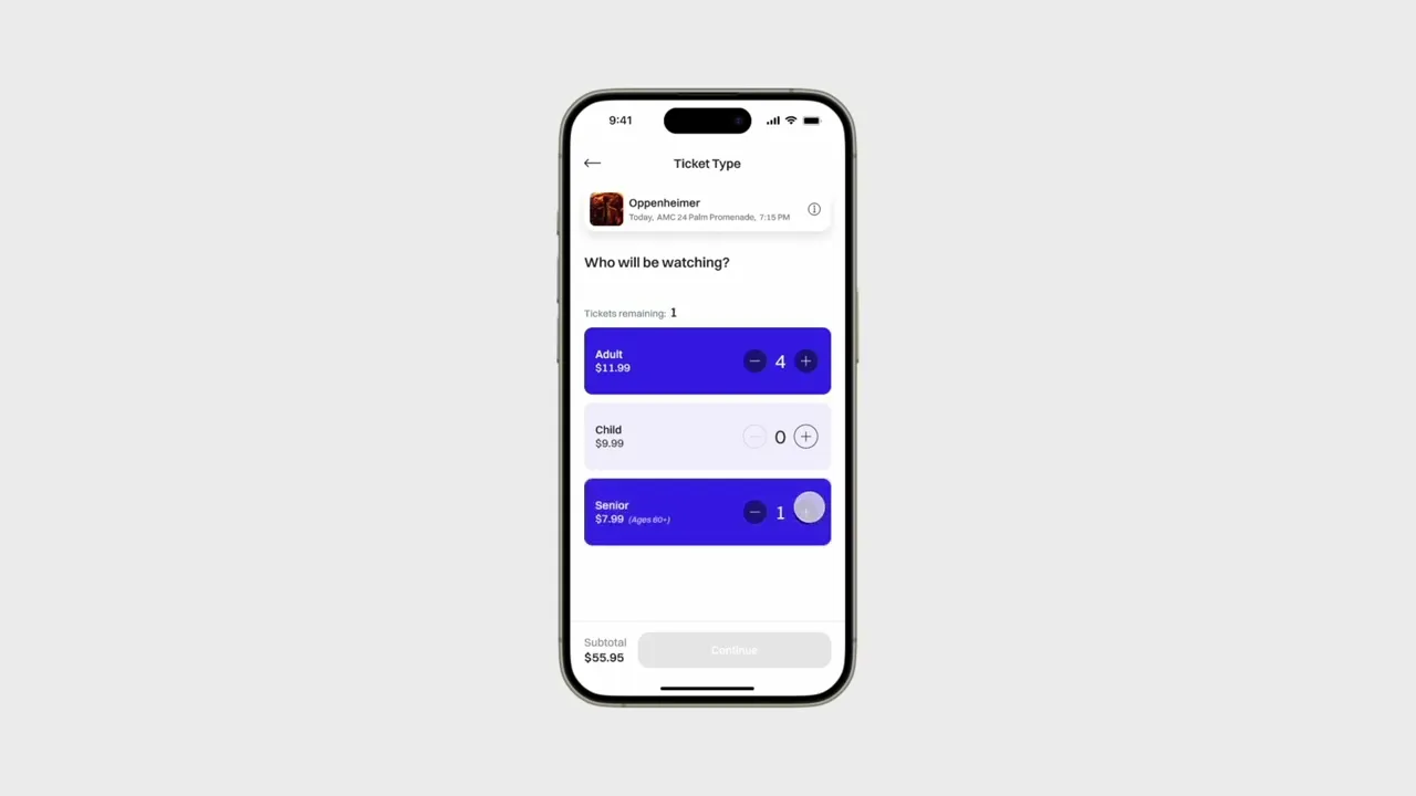
New Feature Split Cost


A
Reasoning
I organized this screen so that the customer could purchase their tickets through a simple step by step process. With the new "Split Cost" feature, customers now have the option to pay the reservation in full or share the cost. Since the remaining steps logically depend on what the user selects, I made section A to be the first and largest elements on the screen.
Pros
Easy to follow layout
Progressive disclosure does not overwhelm user with options
Cons
N/A
B
Reasoning
When a user selects "Split Cost", a listing of each reserved seat becomes visible on the same screen via progressive disclosure. As a result, the Split Cost feature does not feel auxiliary nor does it break the user's flow by navigating them to a separate screen.
Pros
User flow is not interrupted
Cons
Depending on amount if seats reserved, user could feel overwhelmed with the options available
Home Screen Variants


A
Reasoning
I chose this version of the home screen because the tab menu provides an organized format that could make searching for a movie easier and quicker. Additionally, the menu’s fixed position allows it to remain visible, allowing the user to know where they are at all times and not feel lost while searching through multiple options.
Pros
Can reduce search time
Helps the user know where they are in the app
Cons
Horizontal scrolling for users with limited dexterity
Filter and Showtime Variants


A
Reasoning
The name, date, time, and theatre will display across all screens of the reservation process. This allows users to feel confident they are purchasing their original selection.
Pros
Reaffirms user’s selection
Cons
N/A
B
Reasoning
This design displays any filters the user has applied to narrow their search. Users will not need to return to a designated filter screen to remember what they have currently selected, but instead, they can simply glance at this list.
Pros
Promotes the use of filters
Users don’t need to remember the filters they chose, helping reduce cognitive load
Cons
Less screen space for showtime listings
Seat Selection


A
Reasoning
Because of the the natural limited space provided by a mobile device, it was important to consider how I wanted to use the available screen real estate when it came to the seating chart. In this case I chose to have larger seating icons, which equates to larger touch targets for the users. A trade off to consider would be to not display row and seating labels due to the lack of space. However, most users tend to choose seats based on the distance from the screen and prefer middle of the row, which can still be observed with or without seat or row labels.
Pros
Larger touch targets for seats helps those with limited dexterity
Zoom in and out functionality
Cons
Seats may be smaller to press as number of seats in a auditorium increase
B
Reasoning
As a result of point 1, in choosing larger seat touch targets, I provided an area where user’s selections would display in real time below the seating chart.
Pros
Users can receive immediate feedback of their selection in real time
Cons
N/A
MIFI
Don't sleep on MIFI
Once the wireframes were complete, my next step was to transform them into a mid-fidelity prototype so that I could conduct a usability test as soon as possible. My reason for this was to gain valuable feedback sooner, instead of spending time on trying to perfect screens that would need changes anyway. Below are LOFI screens side by side with their MIFI evolution.
USABILITY TEST
Time to put our ideas to the test...literally
Now that I had a working prototype, I proceeded with a usability test. The test was moderated and consisted of (5) pariticpants. Each participant was asked to complete the same (6) tasks. Below is a summary of what I was hoping to learn, what metric the user's performance would be measured by, and a list of the (6) tasks.
Research Goal
Conduct a moderated usability test, and collect user feedback that will help me design an improved movie ticket experience based on user needs
What I Want to Learn
How many users find the ‘Split Cost’ option feature helpful?
Do users find filters useful when looking for a specific showing?
Is the interface intuitive and simple to use?
What is the average time taken to reserve and purchase tickets?
KPIs
Time on task
Conversion rates
System Usability Scale
User Tasks
1
Open up the Boleto app and search for the movie you wish to see
2
Use filters to narrow down your search for a showtime that works best for you
3
Select seats for
a group of 5
4
Next, select 3 adult tickets and 2 senior tickets
5
Upon checkout, use the “Split Cost” option and only pay for 3 of the 5 tickets
6
View your ticket reservation, and share it with your group
RESULTS
First impressions are everything
Below are the results from the usability study, and it's safe to say Boleto did rather well.
Notable User Quotes

Task Summary

KPIs

Affinity Map

ITERATIONS
They spoke, I listened
What first draft is ever perfect? Thanks to the feedback from the usability study, I was able to make adjustments for the new HIFI screens that would improve the overall UX.
Payment Confusion
Previous Feedback
Participant was not sure if payment went through
User felt unsure if they completed the reservation correctly
Changes Made
Change the copy of primary buttons from "Pay" to "Checkout" and "Confirm Purchase". These are widely recognized labels that indicate exactly what will happen when pressed
Included the spinning wheel processing screen to give the user feedback that there purchase has been recognized and is waiting to be completed
Once payment has been processed, users are greeted by a confirmation screen
Seating Selection Struggles
Previous Feedback
Seats were difficult to tap
Users had to bring screen closer to them
Changes Made
Increased touch target size for seat icons
Changed icons for zooming in/out that better represent the function of the button
Increased the magnification of zoom feature to make choosing seats even easier, while still allowing for the maximum selection amount of seats to be visible in frame
HIFI
Boleto in the real world
The time finally came to see Boleto in the user's hands.


PROTOTYPE
The new kid on the block
Below I demonstrate what a typical session would look like when purchaing movie tickets with Boleto.
REFLECTION
Looking back at the journey
Movie goers weren't the only people that benefitted from Boleto. During this whole process I faced many challenges throughout, but overcoming those challenges made me a better designer overall. Checkout my final thoughts below.
Key Takeaways
About 95% of people strictly buy their tickets online only
Learned to design icons for those that were not in the library being used
Competitor audit is a very useful tactic/method
Test as soon as possible, even in LOFI
Challenges
Creating a prototype that responds to user input/selections because of Figma’s logic limitations.
Next Steps
Complete another usability test but with the high fidelity prototype
Design search screen and profile screen
Integrate additional features like member perks, or suggesting food/snacks at checkout
See how ‘Split Cost’ is received
THANK YOU FOR READING ✌🏻