
Listening to the feedback
The HUD provides players with the necessary information needed to be successful in a match. Unfortunately, some players have voiced their frustrations on Reddit, calling the new HUD a major downgrade from the previous one. As a player myself, I too can empathize and even agree with some of their pain points. Below is an image of the current HUD and a list of some of the paint point areas.

Goal
Introduce a new HUD design that reduces the player’s cognitive load, which allows them to focus more on the game and improve their team’s odds of winning
Position, organize, and increase the contrast of HUD components to relieve the requirement of player awareness and memorization. As result, players will be more successful in using available inventory in crucial moments rather than forgetting.
Ideally, current and even new players will need little to no time to adjust to the HUD’s new design.
The new and improved
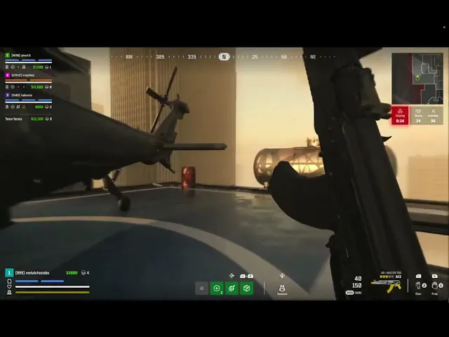
The only true way of knowing whether the new HUD design would work is to see it in action. Below is a prototype that uses the new HUD to demonstrate what a player would see when playing a match.
Taking a closer look
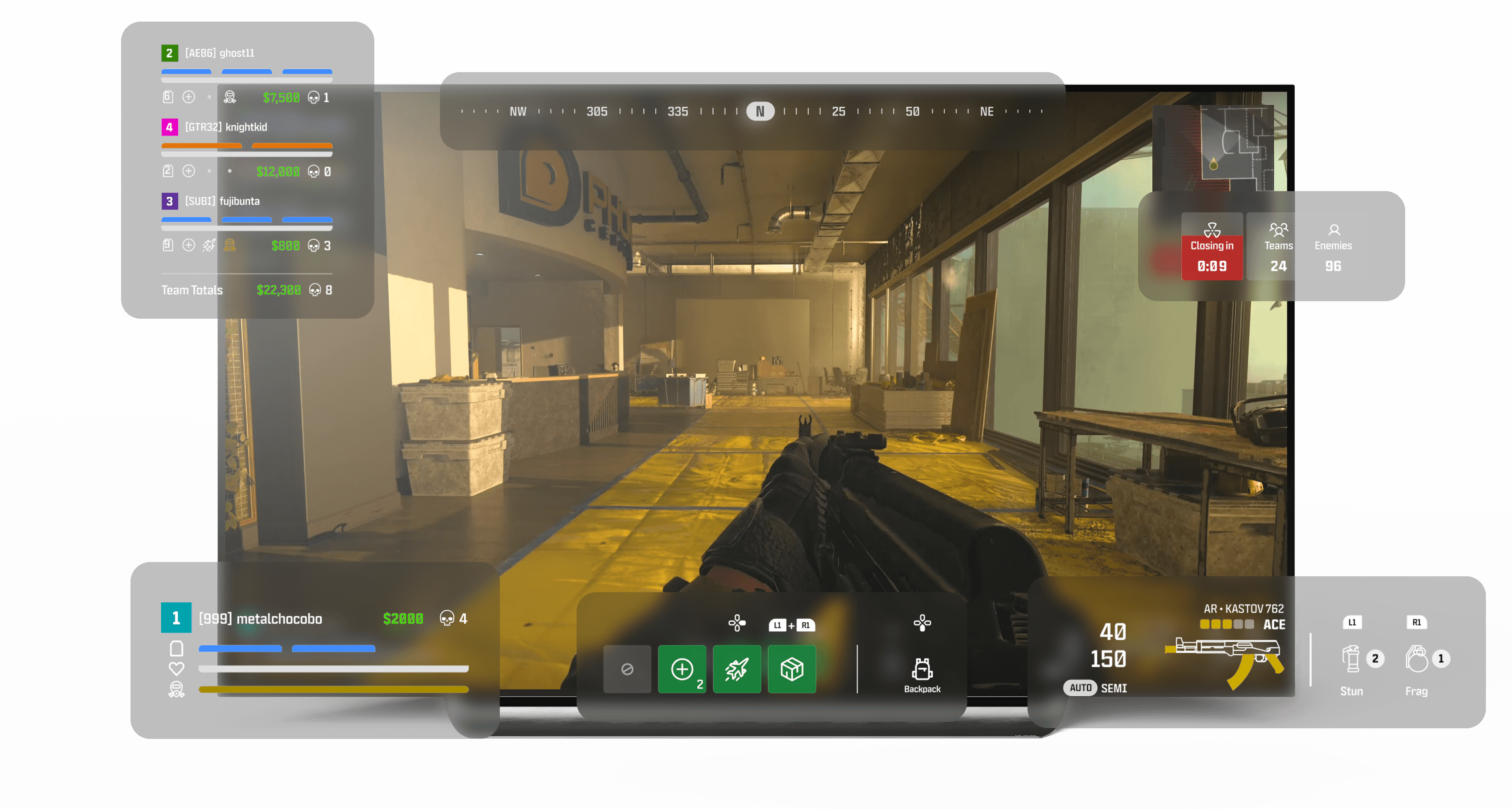
Because of the player's feedback and the goals that resulted from it, I was able to keep the players front and center throughout the design. The main thing was to keep players focused on what mattered most, which is the survival of the team, because a player’s success is very dependent on how well other teammates do. For this reason I made sure not to prioritize one pain point more than the other because of their synergistic relationship. Below you will find, the newly designed HUD with the list of changes that support our goals.

C
Player Inventory
+
Inventory is now grouped together so user always knows where to look
+
New green color provides better contrast against the background. Players can notice available inventory even in peripheral vision which can help players not forget these useful items in clutch moments
+
No longer blocking enemy line of sight which reduces unnecessary distractions from player’s focus
Conclusion
By no means is this newly designed HUD perfect. If anything this is simply another iteration focused on addressing player's current pain points. This design takes the good from the current HUD design, and combines it with new original ideas and features. Ultimately, Warzone will continue to experience new updates, and we can only hope they aid players to play at their highest potential resulting in more fun and less frustrations.
Update! [ May 29, 2024 ]
Just about four months later from when I finished this design, Call of Duty released new patch notes. The notes indicate that new widgets will be added to team health bars just like I have in my designs. Pretty cool if I must say so myself.

At the bottom left corner of the HUD we can now see our teammate's inventory highlighted by the green boxes. In this example, teammate health bars now display the number of shield plates, killstreaks, and gas masks our teammates have.