Overview
Rethinking Instagram's saved content
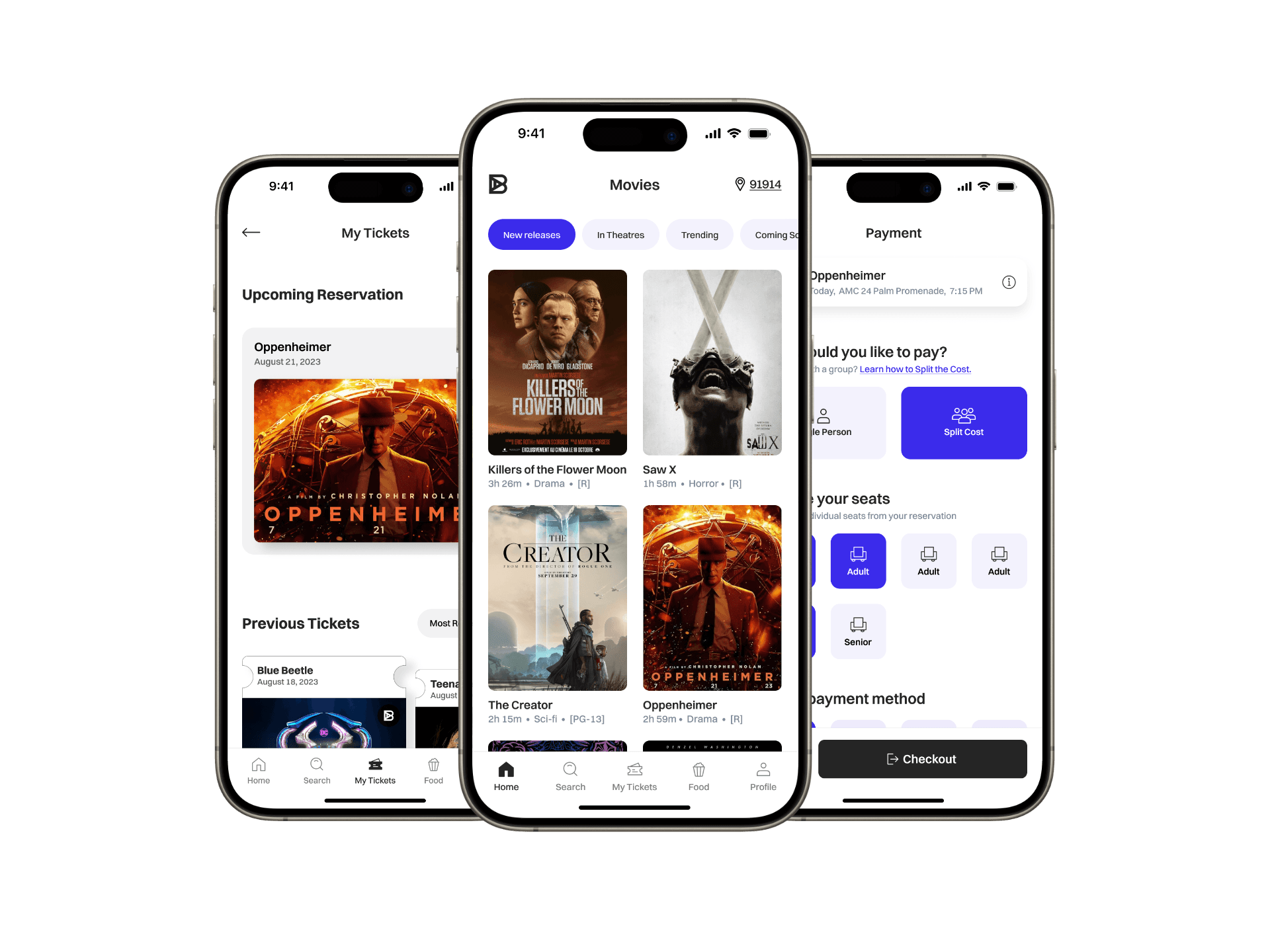
Redesigned Instagram’s saved feature to improve how users navigate, retrieve, and manage saved content.
Scope
Feature redesign • Concept
Platform
Mobile
Role
UI/UX Designer
Problem
When the system works against users
Finding and managing saved content on Instagram can be more difficult than necessary. Misaligned hierarchy and navigation patterns create unclear, competing paths that lead to inefficient scanning, while inconsistent management controls across the feature make actions unpredictable.

The “All" section attempts to group content in one view, reducing the role of navigation. Groups do not align with navigation categories, and certain content is missing.

Multiple paths lead to the same destinations, resulting in slower decision-making and requiring users to remember which path to take.

Management actions are centralized in a single entry point, limiting access everywhere else and preventing actions from aligning with the current content.
Insights
Where the system breaks down
Finding Content
The “All” section attempts to organize content within a single view, reducing the usefulness of navigation
Content grouping does not align with navigation categories, creating conflicting mental models
Multiple entry points lead to the same destinations, introducing uncertainty in decision-making
Limited visibility of certain content requires additional steps and reduces equal prominence across content types
Managing Content
Management actions are not consistently available across sections, making it unclear where actions can be performed
Actions are not always contextual to the selected content, resulting in irrelevant or unavailable options
Bulk actions are restricted to specific entry points, reducing efficiency and requiring users to remember where actions can be performed
Collection creation and organization lack flexibility across content types and follow unintuitive workflows
Design
Building a clearer system
The following changes focus on improving how users find and manage saved content by simplifying structure, clarifying navigation, and enabling consistent actions.
Structure and Navigation

Feature
Compare
Decisions
Simplified the “All” view to a unified grid
Established navigation as the primary browsing method
Removed grouped content from the "All" view
Why
The “All” view served as both a browsing and organizational layer, overlapping with navigation.
Content groups from the "All" view did not align with navigation categories
Considerations
Explored restructuring navigation around content format (e.g. All, Video, Images, Collections), as users are more likely to recall saved content by media type; however, mixed-media posts (such as carousels) introduce ambiguity in categorization, and the approach diverges from Instagram’s established naming conventions (e.g. Posts, Reels).
Tradeoffs
Simplifying the “All” view reduces visibility of collections and grouped content within a single screen
Search and Retrieval

Feature
Compare
Decisions
Provided a search bar with category-based filtering
Scoped search to the current section by default
Allowed switching search scope across categories
Why
Finding content relied heavily on scanning within sections
There was no direct way to locate specific saved items
Tradeoffs
Scoping search to the current section prioritizes focused results, but requires switching categories when searching across all saved content.
Content Representation

Feature
Compare
Decisions
Created visual indicators for audio and single image posts
Why
Not all content types were represented within the grid system (e.g. audio was missing from the “All” view) and single image posts had no icon)
All content types have a thumbnail grid design allowing for a gris system to exists in each category in the nav
Considerations
Considered including Collections in the “All” view to fully include all content types, but this introduced visual challenges and duplication in the grid between collections and their items.
Managing Content

Feature
Compare
Decisions
Centralized management actions in the header
Added contextual actions based on selected content
Enabled selection for managing saved items
Why
Management actions were not consistently available across sections
Actions were not aligned with the selected content
Managing multiple items required interacting with content individually
Tradeoffs
Centralizing actions in the header improves consistency, but increases visual density and moves some actions into a secondary menu.
Outcome
A more predictable experience


Impact
Navigation and content structure now work together
Saved content is easy to retrieve, regardless of when it was saved
All content types are visible within the system
Managing actions are contextual and aligned with the selected content
Result
This redesign creates a more predictable experience within Instagram’s saved feature, making it easier to access and manage content
Exploration
A final design consideration
Before arriving at the final design, I explored simplifying navigation into three categories: Posts, Collections, and Audio to reduce the number of navigation choices and because all content ultimately exists as content "posted" to a user’s profile. Visual indicators could then differentiate content types directly within the grid, allowing users to recall content by format rather than Instagram’s naming conventions, especially when video posts and Reels can appear visually indistinguishable. However, Instagram intentionally separates Posts and Reels across the platform, so I maintained the existing structure to stay aligned with established patterns.
Should navigation reflect Instagram’s naming conventions, or the way users actually recall content?

Let's Connect
I’d love to collaborate or chat with another creative. Looking forward to hearing from you! ✌🏻
Copyright © 2026
Other Projects